Modernizing a B2B E-Commerce Platform for Dealers & Sales Reps
Husqvarna is a global leader in outdoor power products — chainsaws, robotic lawn mowers, trimmers, and garden tractors. Their dealer-facing e-commerce platform had become outdated, making product browsing and purchasing cumbersome for the dealers and sales representatives who depend on it daily.
The goal was to modernize the system by improving navigation, search functionality, and overall usability — creating a seamless shopping experience that matched how dealers actually work.
A Legacy System That No Longer Matched User Expectations
The platform had accumulated years of features without cohesive UX direction. Dealers and sales reps had clear mental models — the platform just didn't match them.
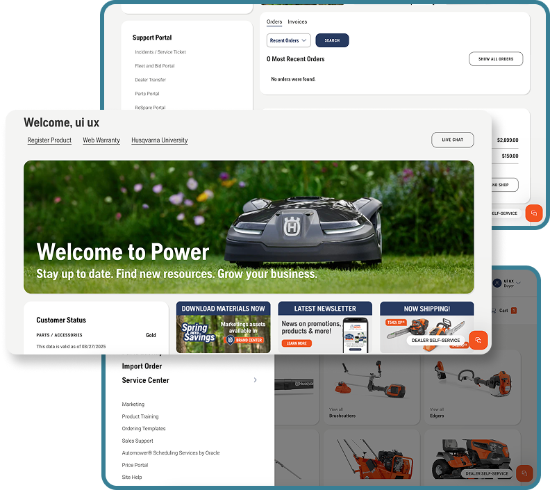
What Existed
- Fragmented navigation that was hard to scan and inconsistent across sections
- Product search lacked predictive capabilities — users had to know the exact SKU
- Checkout flow had unnecessary friction and manual steps
- Performance issues slowed down core dealer workflows
- Legacy HCL constraints limited design flexibility
What Users Needed
- Quick access to products, orders, and pricing from one place
- Predictive search to find parts without deep browsing
- Streamlined order placement and import process
- Consistent experience across Support Portal and the main catalog
- Speed that matched the pace of their daily operations
Understanding How Dealers Really Work
The primary users were dealers and sales representatives who relied on the platform to browse, compare, and order products efficiently. 99% of products are sold through dealers on a desktop — so desktop performance and clarity were non-negotiable.
Key Findings- Dealers preferred streamlined browsing over extensive filtering options
- Predictive search significantly improved product discovery efficiency
- Product Registration was among the most clicked links — yet buried at the bottom
- Optimizing checkout could meaningfully reduce cart abandonment rates
"When I am a dealer managing product orders, I want to quickly browse, compare, and purchase inventory without delays, so I can focus on serving customers and increasing sales."
Three Pillars, Two-Week Sprints
Work was structured around two-week sprint cadences — Week 1: kickoff, wireframes, client review. Week 2: revisions, design acceptance — ensuring consistent alignment between design, development, and stakeholders.
Navigation & Information Architecture
Redesigned the navigation structure with clearer hierarchy. Eyebrow nav integrated into the main menu. Quick Order, Order Status, and Saved Accounts elevated to the primary navigation level.
Search & Product Discovery
Implemented predictive search and dynamic filtering to dramatically improve how dealers find parts and products. Parts Lookup and Import Order elevated in the navigation hierarchy.
Checkout & Order Flow Optimization
Minimized steps in the purchase process — simplified shopping cart, 3-step Import Order flow, and clear order status visibility throughout the buying journey.
A Cleaner, Faster, More Intuitive Experience
The redesigned platform gave dealers a unified, intuitive interface from homepage through order completion. Custom-designed screens prioritized Sales Rep Home, Dashboard, and Shopping Cart — while HCL out-of-the-box handled checkout flows to maintain performance.
Three key user types
Dealers, sales reps, and service center staff all relied on the platform for different jobs — the redesign had to work seamlessly for all three without creating competing hierarchies.
Dealer
Manages day-to-day purchasing of parts and products. Needs fast access to product catalog, quick order tools, and order status — all from a desktop browser.
Sales Representative
Manages multiple dealer accounts and needs a unified Sales Rep Home to access customer status, marketing programs, and ordering templates efficiently.
Service Center Staff
Handles warranty claims, incidents, and fleet management. Needs clear access to Support Portal and Service Center tools without deep navigation.
Outcomes That Moved the Needle
Increased Engagement
Dealers spent more time on the platform due to a cleaner, faster navigation experience that matched their existing mental models and daily workflows.
Higher Conversion
Improved product discovery through predictive search and dynamic filtering led to higher conversion rates and fewer abandoned sessions.
Improved Satisfaction
Streamlined checkout flow and reduced friction in the purchase process translated directly into measurably improved customer satisfaction.
Key Takeaways
Two lessons from this project have shaped how I approach every engagement since.
User Feedback is Crucial
Early user testing revealed insights that shaped essential design decisions and prevented costly adjustments later. Getting feedback before finalizing the design system saved weeks of rework.
Small Details Make a Big Difference
Improvements in micro-interactions and performance tweaks significantly impacted user satisfaction — often more than major structural redesigns.
Sprint Cadence Enables Alignment
Two-week sprints with built-in client review kept design and development in sync, reducing rework and building shared ownership of the solution across all stakeholders.